Friday, 29 January 2010

Lecture by Emma Neuberg


http://www.emmaneuberg.blogspot.com/

During that lecture Emma Neuberg was talking about modernism and semiotics ( untold signs and messages)
20Th-21Th textile print, the geometric patterns, graphic line and super flat colours, and the cultural and technological context of that era.

PICTURE

When Freud appeared and the Darwin evolution theory emerged God disappeared from the front scene , the worlds entered a post world environment where the body is part of the design, it was a process of re-socialism through dress. spots, triangle, stripes were part of the the fashion designs of the moment.
The movement was non-bourgeois , there were no place for romance, femininity, arabesque, divine, ornate or gilded ; modernism was a world of speed, graphic line and bold colour. It was the man machine integration


Soviet textiles industry: men at their machines, planes and uniforms, very propaganda like.


This mentality was very urban and was somehow linked with capitalism and communism. Sonia Delaunay painting

"Techno motifs" appeared using wave and electricity in art
Sonia Delaunay is the first artist to have identified electricity as a technological motif for high fashion, her art work inspired then the modernists motifs in the 60's.


Hans Schwipperts designed building, post war

The pan European architecture of the modernist was round up by the Nazis during WW2, many of Bauhaus modernist designs were Jewish, but their influence persisted post war, one good example is Hans Schwipperts work.


Michele Rosier Dress 1960's

At that time fine artists pushed the boundaries; Bridget Riley work and prints inspired the Mod's movement. Ben Shermann also became an important name with his checked shirts that became an symbols for the Mods and later the Skin heads.


Some other designers linked to the modernist movement were Pierre Cardin, Mary Quant and Michele Rosier.

Plastic, short and bright and bold were very present in the modernist fashion.
There were new form, new shapes and stretch, it meant new ideologies, more freedom.

The women fitted very well into this change, they became the body to represent and assimilate the cultural changes.


The semiotics of that period was obvious, no one talked about the change but it was there to be seen. Michele rosier design presented in ELLE gave subtle messages to the reader: Control/ Machine/ City Life


Photo

magasine cover 1960's


This whole idea was present during modernism, it was structuralist, binary: black/white, heaven/hell, now/never... and that could be seen through fashion.


The check board and black and white, bold colours and geometric shapes are timeless.
Lacoste Sportswear fall 08 presented at Mercedes fashion week.
I found this lecture really great, I love to learn about eras of history that are still very much influencing us, from this lecture I got my idea to use the mini skirt by Mary Quant as my Object analysis.
Some books and texts related to the subject:
  • Stern,R. Against Fashion, 1850-1930, 2005
Weltge-Wortmann,S. Bauhaus textiles: women artists and the weaving workshop, 1998
Troy, V. The modernist textile: Europe and America, 1890-1940, 2006

Decode - Digital Design Sensation


DECODE was interesting and fun.
The first part which was more design on screen was good to look at but the second and third part which was more interactive were sensational and was a great update to what you can currently do digitally and with technology ( I am not sure though what it has to do with digital textile design) .
The entrance path through long "ET fingers" was really cool; in the CODE part I really liked the black and red design that expended ( Lia Arcs 21?) it made thing of blood but in a fascinated way.
My two other favourite one from the INTERACTIVITY and NETWORK part of the exhibition was the clock(Ryoji Ikeda data.scan?), i loved the patchwork effects it has.. and like the idea behind it and the fact that you can go and post your own photo on a website.
The video grid by Ross Phillips was the other one that I spent time looking and participating, the outcome is very funny and I enjoyed myself.


Overall I liked the entertaining side of digital design, I felt like everything can be done using digital devices!

RAC "work in progress" exhibition

I found the work of the MA student innovative, unique and personal and flawlessly presented. I took a business card of the one I really enjoyed...
LIST still to come

I realised , by visiting the exhibition, that I am really interested in the print work, I really like the graphic features of the print work presented there. I also found it interesting the final outcome as it wasn't always fashion focused. a part from the print work I really like the knit work!!

It was good to see their work and it really encourage me to keep going and make the best of my BA.

"Neighbourhood Colour" Exhibition

From what I have seen looking at the work exposed in the exhibition, the students had to look at two areas of London , most of the time different in style and atmosphere, they had to look at their colours.

The work I really liked and found perspiration, in general I was attracted by knit and print work and I found that their final outcome was something I would like doing.
I like the knitted top, knitted in fine grayish yarn, the girl( I don't remember her name but she is so nice!)printed on top of her knit with puff binder and devore, both had a terrific effects on the outfit.
I really liked the combination of print and knit and it showed me that textile design stays open minded at Chelsea.
The second one that I loved is the printed fabric with many different cups and digital printed toasts and the "cat rug", I found it very entertaining and enjoyable to look at, it is very actual and funny!

Amongst other I like the knitted garments in many colourful yarns, it was cool to see some technique she used that I had just learned. it was really standing out.
I liked a lot of the stitch work but mainly I liked seeing a concrete example of what can be done in stitch.

In terms of personal research, I was amazed by the hair drawings a girl did, they looked so real! and I liked her material adaptation which was very explicit.

I was happily surprised by the variety of presentation and that motivated me.

Asking about sustainability to the girl whose print were amazing, I was disappointed to realise that it didn't seem to be a strong value in her work and that with all the chemicals used for screen print, it didn't matter.

Globally I enjoyed looking at every one's work, it helped me a lot toward my specialisation decision.

Friday, 22 January 2010

Mary Quant Mini-dress: object analysis presentation notes and pictures


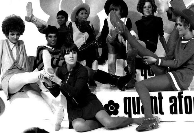
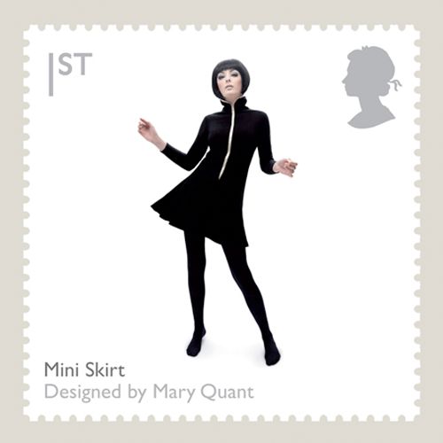
What? The mini-dress by Mary Quant ( black and white mini-dress, bonded wool and nylon hersey. White buttons at the front and white stitched lines at the bottom -Victoria and Albert Museum 1967)
the context:
  • 1960s
  • a generation born after WW II in desperate need of change
  • drab and dutiful fifties VS. Swinging sixties
  • first teenagers
  • play with convention against the established
  • the Mods and ever changing fashion
Why?
  • interested in the link between fashion and society
  • need to learn more about fashion era, and what they represented on a wider scale
  • 1960s in particular, as many think that has happened are still "alive" now
Concept, ideas
  • mini-dress, so more of a women point of view of the 1960s
  • like between the social changes and fashion changes
  • the mini- skirt says a lot about the decade, what other symbols?
Methods of research
  • Videos
  • Internet
  • Books
  • Awareness
  • Key Text: Swinging sixties: Fashion in London and beyond 1955-1970

Designers, Artists, Books
  • Mary Quant
  • John Stephen
  • Twiggy
  • The Beatles, The Who
  • Exhibition: Carnaby Street 50th Birthday, Pictures of Philip Townsend


Some pictures related to my object analysis
First step of my research... looked at website, videos and images
and wrote rough notes and now I need to leave it so it can grow on me...
Felling happy about my choice


Friday, 15 January 2010

Visit To Blythe House

Blythe House is part of the Victoria and Albert Museum and contains archives of artists and companies in decorative arts (not only textiles).
The archives are mainly British based and from the 20's century. they are to be found on the national art line catalog on the V&A website, with all the description needed.

I took some notes of what I liked or what caught my attention and made me want to come back or research further on.
On the first spot, the exposed archives were from Heal a company founded in 1810 whose head quarters were in Tottenham Court Road. there were pretty popular.
The second spot was Ambassador Magasine it is a textiles magasine founded in 1933 it was edited first in Amsterdam and then London (due to 2ND World War, Amsterdam and London editors lost contact and once the war finished London editors had continued publishing).
The third one was Presage a fashion and textile forecast magasine published in Paris in 1961.
I really liked that one because of the way the presented the magasine and how it is just full of samples and colours and drawings.I enjoyed looking at the 60's fashion design.
The fourth one is was W.Gordon Hunton who was a calico printer in the 40's and invented this device, glass curved in a way that the drawing would repeat and create a pattern. I admire the drawings a lot because they were simply beautiful made.
The fifth spot was Samuel Courtaulds which was more of a furnishing textile company, it was the 1940's biggest textile manufacturer.
we also had the opportunity to look at Oberkampf samples (1830-1860 -French printed )and as well as Lyon collection of silk (19th century - French) and Morton Sundour textiles sample ( 20th century:20's,30's and 50's) in big, old book that smelt moist.
I took rough notes of the things that caught my attention and that I would like to find out about a bit more:
The company Reichenbach and Co from St-Gall Switzerland
I would like to learn more about Swiss textiles
The colour combination sheet
the way they presented it with an A4 page with lines of coloured circle and over it an A4 page with 5 holes and depending and how the page moves it gives different colour palette (Presage)
W. Gordon Hunton drawing of little characters in a graphic style
I liked the modernity, it is comic book like
Drawing on Frieze paper
Tricel?
I found amazing the quality of the work presented in term of its conservation.

Wednesday, 6 January 2010

Desconocida: Unknown by Lise Bjorne Linnert


This exhibition was on at the Gallery UCA Epsom from February,10th until March, 22nd 2009.

I have read about it in MAGAZINE NAME , it caught my attention because I felt it has a meaning, a message to it.

The Norwegian artist, Lise Bjorne Linnert, research and based her exhibition about the Maquilladoras in Cuidad Juarez in Mexico.

the Maquilladoras job consists in working for Western companies that employs Mexican worker on low wages to do mostly, night shifts. The majority of the workers are women and they are prone to kidnapping, rape and torture.

"It is the cruel picture of the dark side of globalization, corruption and in-balance between the people of power and money and the huge population of poor in desperate need of jobs."


Lise Bjorne Linnert used sound, film and thread to represent this injustice. she created workshops where all the participants create name tags by stitch the victims name on pieces of fabric, some of them called:"unknown" as they are many of them that are not recognized.